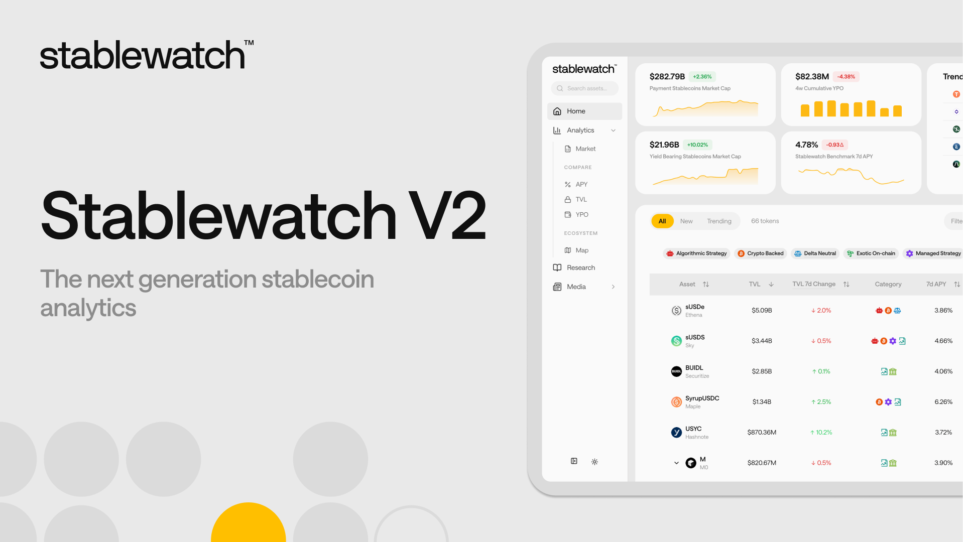
Stablewatch V2: The next Generation Stablecoin Analytics
The Yield-Bearing Stablecoin (YBS) market has fundamentally evolved into a complex, multi-billion dollar ecosystem. Navigating this landscape today demands more than simple APY trackers; it requires a sophisticated, data-driven framework.
To accommodate for the growing complexity of this market, we are launching a major evolution of the stablewatch.io analytics platform. Our new dashboard builds upon the robust analytical foundation, redesigned as a comprehensive command center engineered to help you deconstruct the YBS landscape.
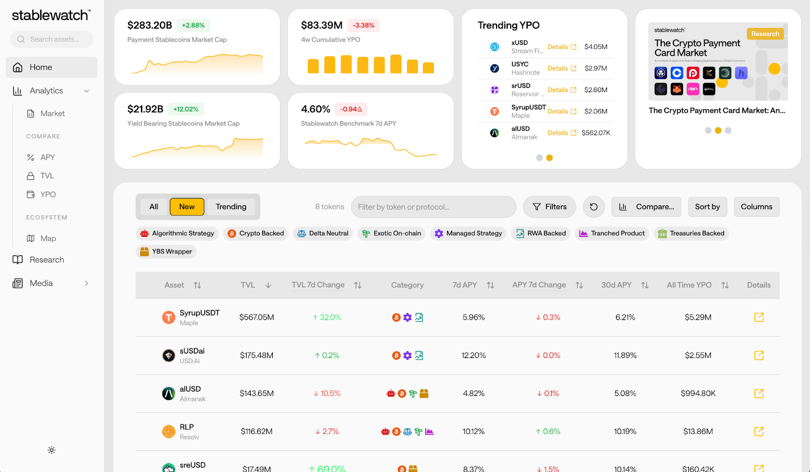
In a single screen, you get an immediate, high-level market snapshot — from the total market cap of payment stablecoins, through the highlights of our recent research, down to trending yield payouts — before drilling down into the granular data that matters in the tables below.
The new navigation sidebar acts as your guide, cleanly separating our tools into logical categories. You will find the brand-new Market overview, the enhanced Compare suite, and Ecosystem mapping, now all in one place. The Market tab is the new heart of our macro-level analytics, housing our most powerful new visualizations. Meanwhile, familiar features, like our APY and TVL comparisons, have been restructured into the 'Compare' section for a more focused experience.
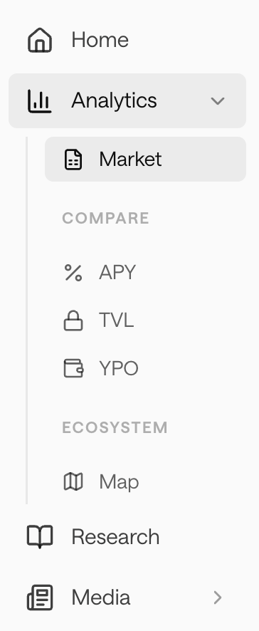
This new structure eliminates friction, placing our powerful Market analytics front-and-center. Our familiar, robust tools are now organized exactly where you expect, so you can move from macro-level questions to granular analysis seamlessly.
Let's walk through it. This dashboard provides a complete, top-down view of the YBS ecosystem. Now, you can instantly grasp its scale, identify its dominant players, and track the capital rotation between them.
First, we establish the big picture. The YBS market has demonstrated explosive growth, expanding to over $12.5B in total supply. With the new module, you can track this historical growth and compare the growth velocity of different stablecoin projects.
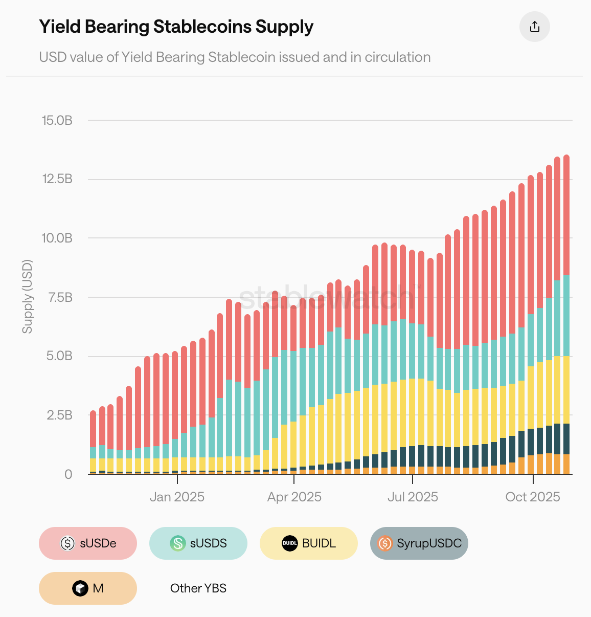
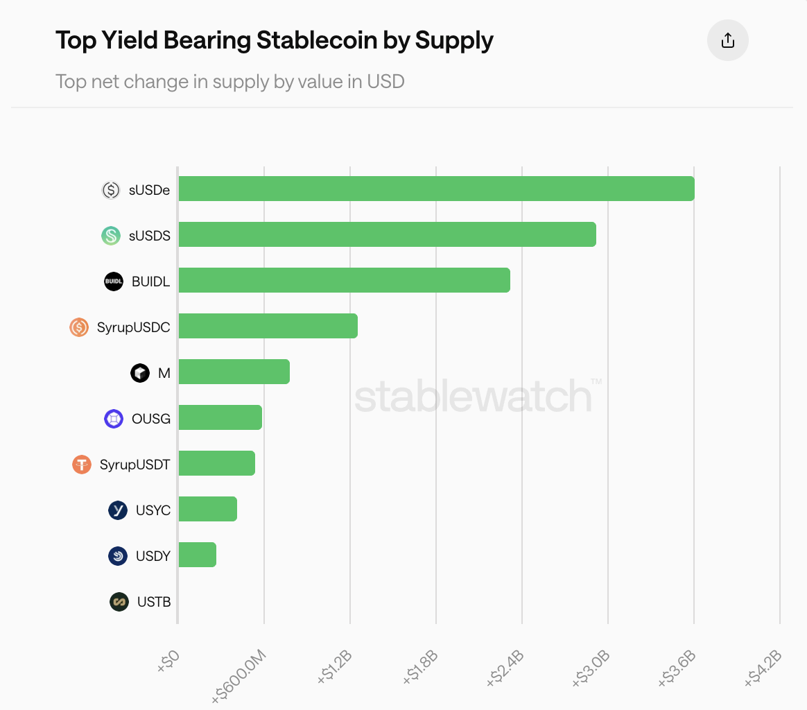
Understanding total supply is only the first step. To see who is winning the capital rotation, we've broken down the net change in supply. This view clearly identifies which protocols are attracting the most new capital and driving market expansion.
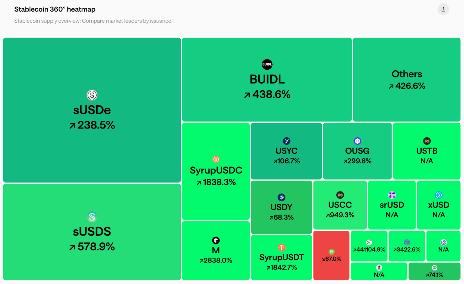
For a bird’s eye view of the market, the 360° heatmap provides a data-driven overview of different stablecoins’ dominance. With this visualization, you can assess the competitive landscape at a glance as it instantly communicates market leadership and recent growth velocity.
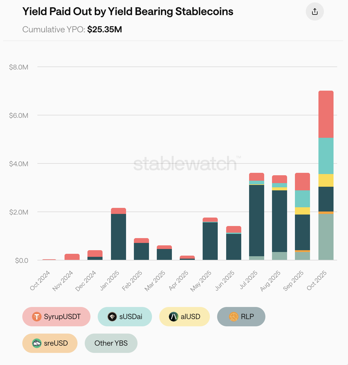
Next, we move from supply metrics to value returned. We track the cumulative Yield Paid Out (YPO) by these stablecoins: a tangible, realized yield that has actually been delivered to asset holders over time. Here you can also see a breakdown of major contributors to the growth of the YPO.
The final module of our Market dashboard is designed to move you beyond marketing claims. It gives you the power to analyze assets based on their true historical performance, simulate current growth extrapolations, and visualize the APY to TVL balance across the market.
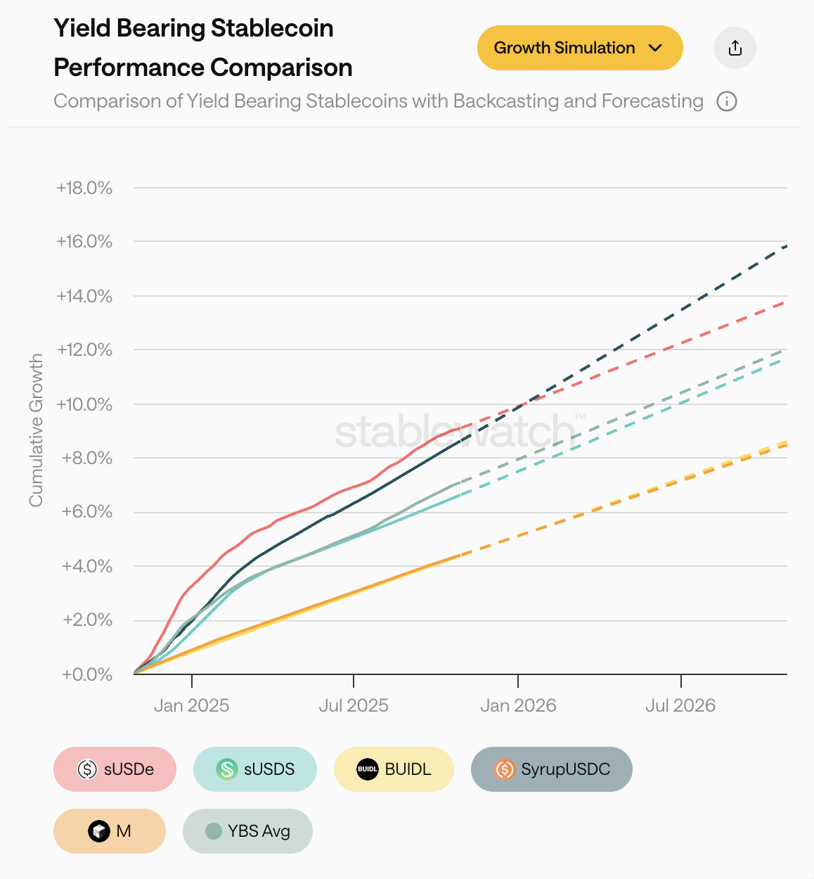
APY is only part of the story. Our performance charts let you track the actual cumulative growth of different stablecoins, providing a clean, data-driven baseline of their historical performance head-to-head.
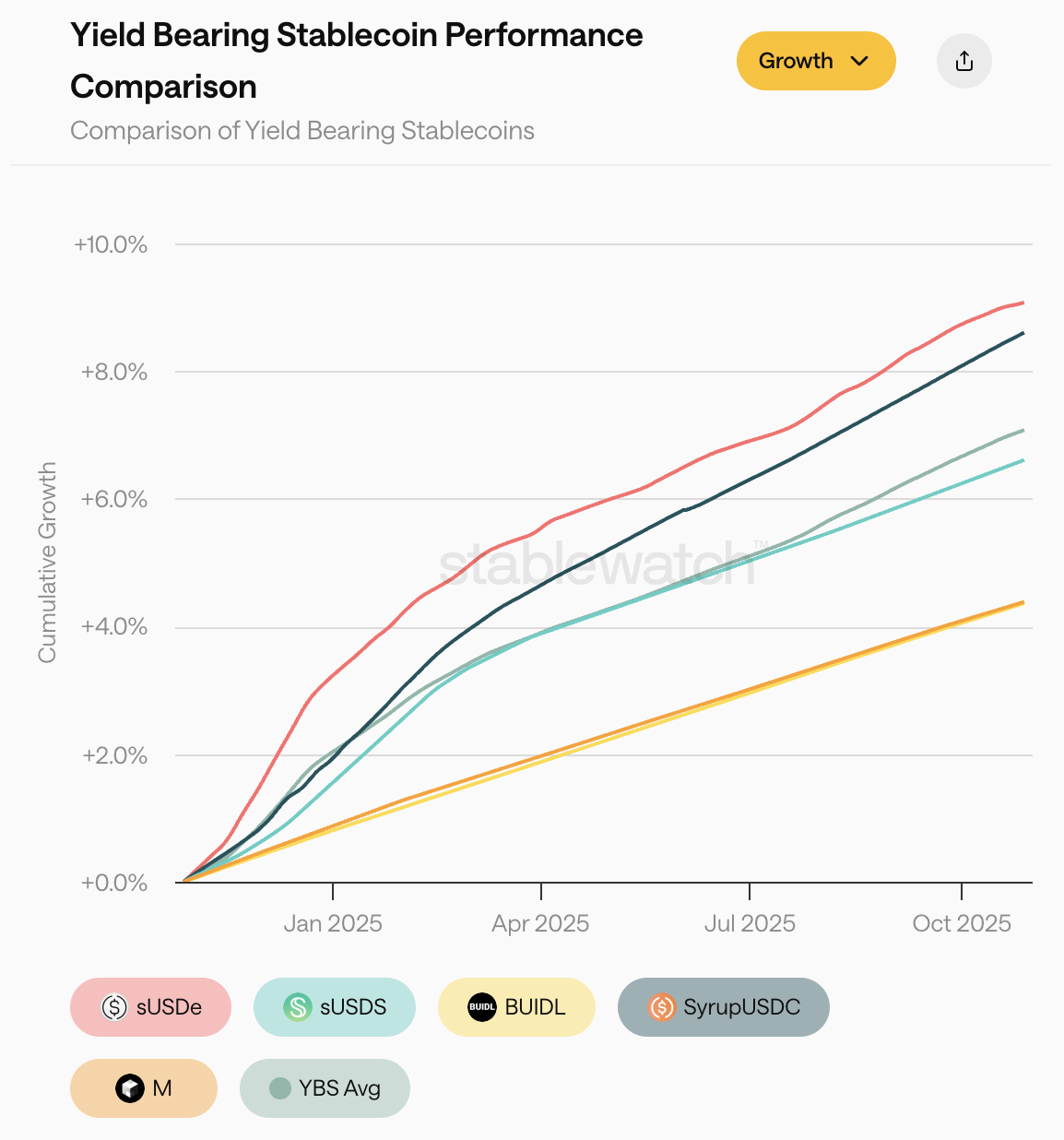
From this historical data, you can toggle the "Growth Simulation" view, which provides simple forecasting, extending the recent performance trends forward. This feature can help you visualise the long-term implications of current trajectories.
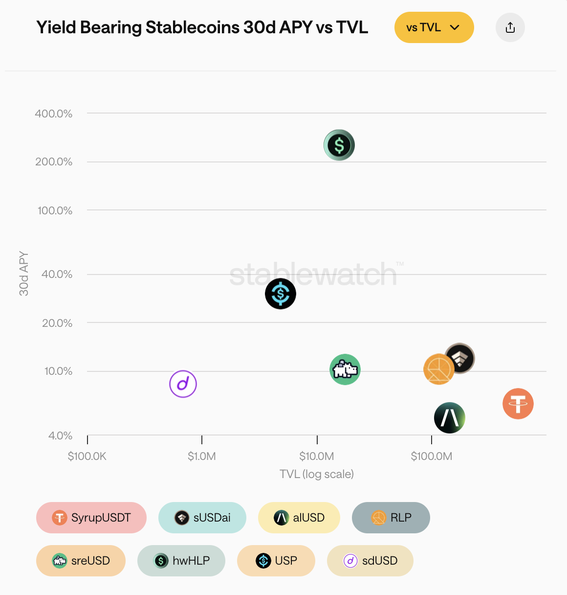
The final view in this suite is our 30d APY vs. TVL scatter plot — a powerful tool for strategic analysis. The chart instantly segments the market, identifying high-yield hidden gems versus established lower-yield blue chips, while assessing their overall liquidity conditions all in one place.
Together, these three views provide a comprehensive framework for moving from historical analysis to strategically positioning your portfolio, all within a single, unified module.
This redesign marks an evolution of Stablewatch. We've built upon our strong foundation as a trusted data provider to deliver a full suite analytics engine. The new Stablewatch is more than a dashboard; it is an evidence-based framework designed to bring clarity to a complex market by giving you clear, actionable data.
We've built the tools. Your analysis starts now.
Explore the new dashboard at app.stablewatch.io.

About Piotr Kabaciński
Piotr is a Senior Researcher at Stablewatch focused on in-depth research and developing risk models for innovative stablecoin solutions. He holds a PhD in Ultrafast Spectroscopy from Politecnico di Milano, and has coauthored over 15 high-impact papers in leading scientific journals. He has worked in DeFi as an investor for venture capital firms Geometry and Synergis Capital, founded a startup, and worked as a Quantitative Researcher at Luban.