Debasement Benchmarking Your YBS Portfolio

There is a severe lack of education in the investment community about the rate at which dollar denominated assets lose value. Monetary debasement and the associated inflation rate is a hidden tax that is placed on all participants within fiat currency systems.
“The arithmetic makes it plain that inflation is a far more devastating tax than anything that has been enacted by our legislature”
- Warren Buffet
“Of the roughly 750 currencies that have existed since 1700, only about 20% remain, and of those that remain all have been devalued”
- Ray Dalio
As one of the stewards of a yield bearing stablecoin (YBS) dashboard providing analytics on dollar denominated yield products, I felt it would be irresponsible to disregard this significant force impacting the real returns of YBSs.

“Money printer goes brrr” is a phrase that has dominated the investment netscape in recent years. Synonymous with bullish market performance it has become a rallying cry for retail investors across many venues and asset classes. Originating from a tweet by X (Twitter) user @femalelandlords which depicted a Zoomer wearing an anarcho-capitalist bowtie pleading with a Boomer Wojak representing the United States Federal Reserve not to "artificially inflate the economy by creating money to fight an economic downturn," leading the Federal Reserve to reply "haha money printer go brrr". This meme and its variations have dominated the ranks of CT and the r/WallStreetBets subreddit as a celebratory response to any expansionary monetary policy. So what actually makes the money printer go “brrr” and why does that lead to increased asset prices?

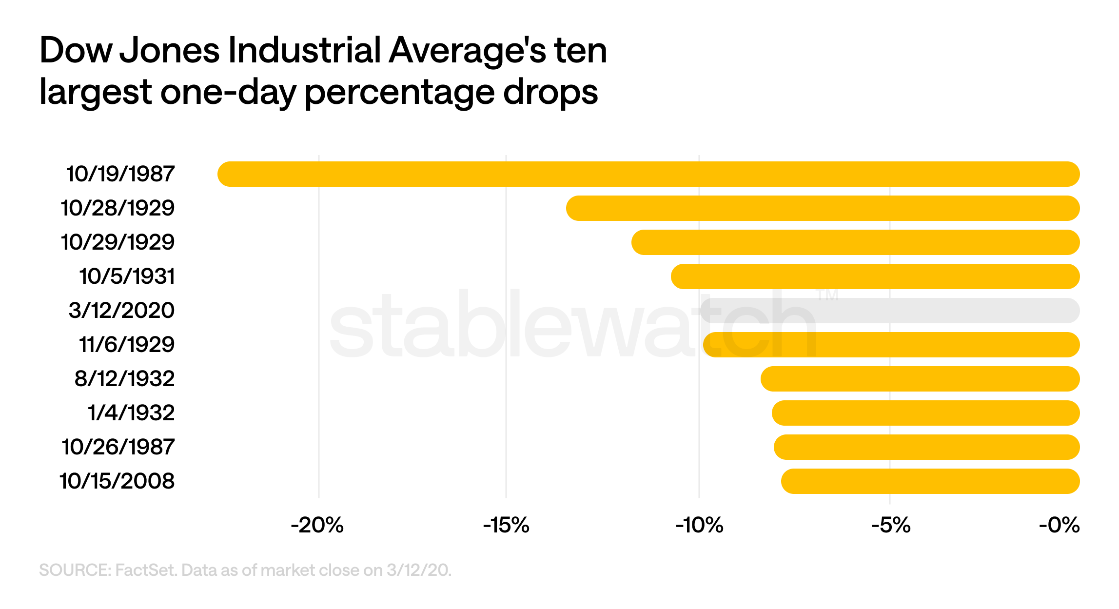
Let’s examine the setting that birthed this meme in order to better understand this social phenomenon. March 2020 was a troubling time, Covid-19 was officially declared a pandemic by the WHO. Global supply chains were in disarray, with the International Labour Organization estimating 400 million full-time job equivalents lost between April and June 2020. World Trade Organisation (WTO) data shows contact-intensive sectors like passenger transportation, arts, entertainment, tourism, and hospitality having declines of up to 30% in Q2 2020 compared to Q1. The reduction in spending on travel and factory output significantly impacted oil demand, causing prices to fall drastically. With the Russia-Saudi Arabia oil price war further worsening the situation, oil prices hit a 14-year low in March 2020. This global turmoil was painted with dark red candles in the US markets. March 16th sent the Dow plunging 2,997 points, or 12.9%. The S&P 500 plummeted 12%, its worst day since 1987.

These unprecedented times resulted in the need for unprecedented measures.On March 15th the Federal Open Market Committee (FOMC), the governing body of the Federal Reserve (FED) responsible for setting the federal funds rate, voted to lower it to a range of 0% to 0.25% effectively bringing it to the zero lower bound. The federal funds rate is the rate at which banks lend to each other overnight. Moreover, it affects banks’ secured lending using US treasury bonds as collateral. A lower federal funds rate means that banks have a lower cost of capital. This in turn allows them to offer a lower prime rate - the interest rate they charge their most creditworthy customers. This trickles down to everything from mortgages to credit card debt, encouraging consumers to spend as the cost of borrowing becomes negligible. As bank lending activity creates money (every dollar lent out is a new dollar added to the total liquidity), the low interest rates increasing the demand for borrowing effectively acts as a money printer. On top of that, at times when loans are cheap, so is leverage, and the newly created money flows back into the markets at an accelerated rate.

Effective on the 16th of March, the FOMC initiated an expansion of its asset repurchase program committing to purchase at least $500 billion in U.S. Treasury securities and $200 billion in agency mortgage-backed securities (MBS). This action was intended to address the acute lack of liquidity in the financial markets. On March 23, 2020, the FED escalated its commitment by adopting an open-ended approach, pledging to buy securities in “the amounts needed to support smooth market functioning.”
From June 2020, they took on $80 billion in Treasuries and $40 billion in MBS purchases per month. This stabilised markets through the FED acting as a buyer of last resort, preventing fire sales of assets and curbing the panic-driven sell-offs that characterised early 2020.
Placing commercial bank held assets on the FED balance sheet increases their cash reserves enabling them to facilitate the heightened withdrawals during the crisis. This is also done to allow them to meet the increased loan demand spurred on by the drop in the federal funds rate.
This policy tool is called Quantitative Easing, and it is one of the most drastic ones in the FED’s arsenal. Usually only enacted during periods of effectively 0% federal funds rate, when further action is still required to prop up the economy.
Lowering the federal funds rate and quantitative easing were supplemented by emergency lending under Section 13(3) of the Federal Reserve Act, with US Treasury approval. Additionally Dollar Swap Lines were opened up, in coordination with foreign central banks such as the Bank of Canada and the Bank of England.
The combination of these factors had an immense effect on borrowing costs, causing them to drop drastically, which was exemplified by the 30-year fixed mortgage rates dropping to 2.65% in January 2021. This spurred consumer spending, while the emergency lending ensured credit flow, preventing widespread bankruptcies.
In what may seem as an economic marvel, the S&P 500 and DOW Jones Industrial Average recovered to pre-pandemic levels by August 2020, boosting household wealth. Unemployment fell from 14.7% in April 2020 to 3.5% by December 2022, and real GDP rebounded by 5.9% in 2021 after a 3.4% contraction in 2020. The measures undertaken provided a successful recovery for the American economy.
The brown line shows the Quantitative Easing reflected in the FED's balance sheet, this combined with the dropping of the Federal Funds rate shown in green led the recovery of the Dow Jones and S&P 500 shown by the red and blue lines respectively.

So while the money printer does not actually go “brrr”, the FED buys bank assets digitally crediting the bank within their FED master account. By allowing the banks to lend more freely depending on their risk appetite, this policy expands the money supply and liquidity and drives down the cost of leverage. Consequently, capital floods into risk assets, such as stocks and crypto, causing sharp rebounds in the S&P 500. It is this rapid market recovery that fuels the speculative mania among the retail legions of r/WallStreetBets and Crypto Twitter (CT) dwellers, who are conditioned to act on even the slightest sign of further expansionary monetary policy from the FED.
Happy ending? Not quite. In the lore of CT there is a phrase that I believe exemplifies this situation: "if you don't know where does the yield come from, you are the yield". Namely you, the dollar holder are the yield. Your purchasing power is getting vaporised in order to save the economy.
Let me explain.

While I am being facetious in this meme, since the measures taken to provide liquidity and excess reserves to banks (insiders) were necessary to avoid a recession. There is a good reason for an informed investor to understand how the FED’s policy affects your purchasing power and hence real wealth.
Fuelled by cheap loans and further injections of cash into the economy through stimulus packages for businesses and households, the nominal spending ability of American citizens and enterprises surged. When this new demand was not met by a corresponding increase in the supply of goods and services, businesses began raising prices to manage limited inventory and maximise profits. This inflationary pressure drove the Consumer Price Index (CPI) to a 40-year high, peaking in June 2022 at 9.1% with it hovering above 4% for much of the 2021-2023 period.
The chart below shows the three main metrics through which that inflation is measured.

Inflation
Inflation is the rate at which the level of prices for goods and services in an economy increases over time, resulting in a decrease in the purchasing power of money.
Consumer Price Index
The most commonly adopted method of measuring inflation is the Consumer Price Index (CPI) which in the US is compiled monthly by the U.S. Bureau of Labor Statistics (BLS). To calculate CPI, the BLS collects price data for approximately 80,000 items, weights them based on consumer spending patterns from surveys, and compares the total cost to a base year (set to 100).
You can find updated CPI statistics on the BLS site: https://www.bls.gov/cpi/.
Some of the known limitations of the CPI as a true measure of consumer purchasing power are:
- Measurement Errors: PPI data may reflect measurement errors that occur during collection, leading to inaccurate expenditure calculations.
- Substitution Bias: The CPI assumes a fixed basket, but if, for example, beef prices rise, consumers might buy more chicken, which the CPI doesn’t account for, leading to overestimation.
- Quality Change Bias: If a product’s price increases due to better features, the CPI might treat this as inflation, though it’s a quality improvement.
- New Product Bias: Due to the time lag of Methodological changes new more affordable products may not be included immediately, potentially overestimating inflation.
- Outlet Substitution Bias: CPI measures price changes at a fixed set of outlets hence if consumers shift to another cheaper venue, the CPI might miss this.

Producer Price Index
The Producer Price Index (PPI), also overseen by the BLS, tracks the average change in selling prices received by domestic producers for their goods and services, serving as a leading indicator of consumer price trends. PPI is calculated by collecting price data from producers across various industries, focusing on the first commercial transaction, and aggregating these into an index reflecting price changes over time. Released monthly, it aids businesses in anticipating cost pressures.
You can find updated PPI statistics on the BLS site: https://www.bls.gov/ppi/.
Some of the known limitations of the PPI as a true measure of consumer purchasing power are:
- Measurement Errors: PPI data may reflect measurement errors that occur during collection, leading to inaccurate costs calculations.
- Doesn’t Reflect Consumer Prices: PPI measures producer-level prices, which could not align with retail prices if markups or other retail costs change at a different rate.
- Volatility: Due to the inclusion of commodities like energy and metals, PPI can have large swings making it less stable than CPI.

Personal Consumption Expenditure Price Index
The Personal Consumption Expenditures (PCE) Price Index, compiled by the Bureau of Economic Analysis, measures price changes for goods and services purchased by consumers, including rural households, making it broader than CPI. It’s calculated using business survey data to estimate consumer spending and price changes, with weights that adjust dynamically to reflect shifting consumption patterns. Released monthly in the Personal Income and Outlays report, PCE is the FED’s preferred metric for monetary policy due to its flexibility.
You can find the updated PCE statistics on the Bureau of Economic Analysis site: https://www.bea.gov/data/personal-consumption-expenditures-price-index
The known flaws in the PCE price index as a true measure of consumer purchasing power are:
- Measurement Errors: PCE data may reflect measurement errors that occur during collection, leading to inaccurate expenditure calculations.
- Classification Errors: After collection, errors may occur in classifying data within the personal sector and other sectors comprising the national accounts, since PCE is part of the National Income and Product Accounts constructed by the BEA.
- Revision Bias: Prior PCE figures are subject to annual revisions, which can result in different measurements over extended periods and may reflect challenges in accurately valuing personal consumption expenditures.

Truflation US Inflation Index
Truflation, launched in December 2021, is an oracle operating onchain inflation metrics designed to offer real-time, independent data. It aims to provide a more accurate and timely alternative to the CPI by updating daily. Truflation claims to collect over 18 million price points from more than 60 data providers, across 12 spending categories like housing, food, and transportation. Its methodology involves a seven-step process: establishing household expenditure weights, sourcing data daily at 10:30 PM UTC, performing automated quality control checks (e.g., historical comparisons and ensuring 13 months of data for year-over-year analysis), normalising data to a 2010 base index, applying category weights updated annually in February, aggregating into a weighted inflation index, and verifying data on-chain. Truflation claims 99.97% accuracy and predicts inflation trends 45 days ahead of the BLS.
Public data providers:
NielsenIQ, GfK, Amazon, Big Mac Index, Walmart, Zillow, Trulia, Penn State University, MRI (Marginal Rent Inflation) Index, Real Capital Analytics, Yahoo, Energy Information Administration, OPIS, AAA Gas prices, JD Powers, CarGurus, Numbeo, Statista, CoreLogic, Kantar, Trivago, Hilton, Hyatt, etc.
Truflation metrics are available through a paid API or on their website: https://truflation.com/marketplace/us-inflation-rate
Some potential flaws I noticed within the Truflation US Inflation Index framework are:
- Lack of Quality Adjustment Mechanisms: The methodology does not seem to address quality adjustments for goods and services for example improvements in computer processing power.
- Flawed Housing Data Representation: Housing data, particularly for rented and owned dwellings, relies on online sources like Zillow and Redfin thus skewing toward new tenant costs rather than the broader existing housing market.
- Lack of Chain-Price Techniques: Truflation does not update the basket of goods and services to reflect changes in consumption patterns, they rely on their comprehensive dataset of current prices, spend, and volumes to calculate averages without adjusting for changes in the basket over time.

Inflation Adjusted Returns
Now that we are familiar with how each inflation metric is created, let's see how each would stack up against each other to render real returns from the top performing assets by TVL on Stablewatch Yield Bearing Stablecoin dashboard.
The latest inflation statistics at the time of this writing for each metric are
- CPI: 2.7%
- PPI: 2.3%
- PCE: 2.6%
- Truflation: 1.67%
Bear in mind that CPI, PPI and PCE are for the month of June, while Truflation is updated daily.
Debasement
The issue with using inflation metrics in order to benchmark your portfolio for your loss of purchasing power is that it is like dealing with a disease by just treating its symptoms. Rather we need to look at the root cause.
Quantitative Easing increases FEDs balance sheet, meaning it holds increased assets in the form of U.S. Treasuries, MBS and liabilities in the form of reserves credited to the banks. After the measures undertaken in March 2020 the FEDs balance sheet expanded dramatically, growing from $4.2 trillion in February 2020 to $7.1 trillion by November 2020, and eventually peaking at $8.9 trillion in April 2022. The FED balance sheet expansion eventually causes the supply of money in the economy to expand, as we discussed prior.

Money supply is measured in four distinct ways:
- M0, or the monetary base, is the most liquid form of money supply, consisting of physical currency (coins and paper money) in circulation and reserves held by commercial banks at the central bank.
- M1 includes M0 plus highly liquid assets used for transactions, such as demand deposits (checking accounts) and other checkable deposits. It represents money readily available for spending and payments.
- M2: M2 encompasses M1 plus less liquid assets like savings deposits, small-denomination time deposits and retail money market mutual fund shares. It captures money that can be quickly converted to cash, providing insight into broader economic trends.
- M3: M3 includes M2 plus large, less liquid assets such as large time deposits, institutional money market funds, and short-term repurchase agreements.
For the purposes of this investigation we will be using M2 as it offers the best view into money readily available for transactions and short-term savings that drive economic activity.
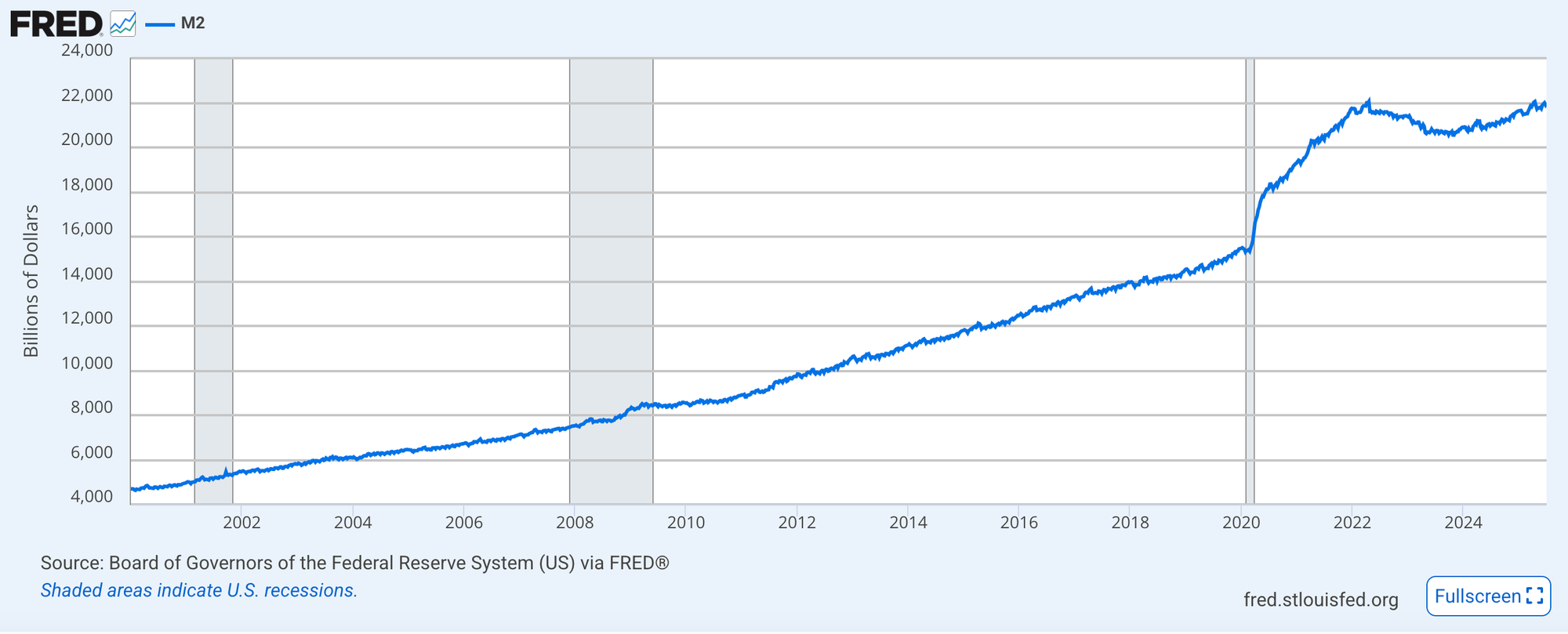
M2 expanding naturally in accordance with GDP growth is generally considered to be sustainable. Thus is due to it aligning the growth of money in circulation with the economy's capacity to produce goods and services.
The issue is when M2 growth outpaces the level of GDP meaning that there is more money supply in the economy than goods and services to keep the purchasing power of that money constant. Hence your money gets less valuable with an ever increasing M2 as there is a finite amount of resources available in the world.
We can calculate the rate of debasement by taking away the real GDP growth rate from the M2 growth rate giving us the percentage by which the money supply is expanding unsustainably.

Observe below as the graph plotting debasement reaches a peak of 27% in 2020 during the immense influx of liquidity after measures taken by the FED to prop up the economy during the Covid-induced crash. Additionally you can see as debasement tapers off in the latter part of 2023 and 2024 reaching negative levels due to the contraction of interest rates.

Well you might say the level of debasement in 2020 was necessary to save the economy from the potential collapse and the FED has since reversed course defending higher rates. I would now direct you to take a look at the graph which plots M2 as a percentage of Real GDP. This graph shows the cumulative effect of debasement and is far less flattering. This is why it is important to understand and hedge your portfolio against actions undertaken by the forces which control the supply of the US dollar.

The current rate of debasement rests at 2.256. To compare with our array of inflation benchmarks we will round the value up to 2.3. Interestingly with this approach it aligns perfectly with June’s PPI value.
I know that 2.3% may seem like a small number, and the average since 1982 at 3.41% also seems rather manageable, e.g. with just farming the funding rate basis trade through Ethena. However, the real story is in the compounding rate of debasement. The cumulative debasement over 43 years has been 28,233% which is nothing to scoff at. The annualised rate is 13.95% over that same period. The longer you hold dollars the more you are exposed to this hidden tax, a direct theft of value from current to new dollar holders. The current situation seems drastic, but it could get a lot worse.
The Past and Future of Debasement
They say that history does not repeat itself but it sure does rhyme. Debasement is not a new phenomenon. As far back as governments have had power over currency issuance, they have always been tempted to overspend and debasement has always followed.
Ancient Rome saw many periods of debasement leading to the abandonment of each successive version of silver coin (Denarius, Antoninianus, Argenteus, Siliqua). However it was exemplified in the reign of Nero in 64 CE, reducing the denarius’ silver content from 4.5 grams to 3.8 grams to fund military campaigns, public works like aqueducts, and imperial extravagance, a trend that continued until silver coinage was only 2% silver by the third century CE. The resulting economic instability fueled social unrest and became a leading cause of the Crisis of the Third Century, which saw the Empire splinter into three separate political entities: the Gallic Empire, the Roman Empire, and the Palmyrene Empire.
Under Kublai Khan (1260–1294), the Mongol Empire’s Yuan Dynasty introduced paper currency, chao, in 1260, backed by silk and precious metals, to unify trade across vast territories, supported by the Pax Mongolica (stabilising effects that unifying Mongol rule had on mainland China) and printed in the capital Khanbaliq. The chao evolved through three monetary regimes: full silver convertibility, nominal silver convertibility, and a fiat standard. While initially it was successful, the over-issuance to fund military campaigns, like the Song Dynasty conquest by 1279, and imperial opulence led to severe inflation by the 1280s. Hence devaluation of the currency causing immense merchant distrust, as described in the Travels of Marco Polo. This significantly disrupted commerce and eroded public confidence, weakening the Yuan Dynasty and contributing to its collapse by 1368 when the Ming Dynasty overthrew Mongol rule.

To address severe war debts and a deepening fiscal crisis, the French Republic began issuing paper money called assignats in the 1790s. Initially introduced as bonds in 1789, backed by 400 million livres of confiscated church lands, they were declared legal tender by 1790.
The French Revolutionary Wars (1792–1802) made the situation even worse and led to excessive assignat printing. This ballooned circulation to 45 billion livres by 1796, triggering hyperinflation with prices soaring over 100% monthly by 1795, rendering assignats nearly worthless (0.25% of face value). The 1793 Maximum Price Act exacerbated existing goods shortages thereby completely eroding trust and fueling unrest. The system collapsed in 1796, symbolized by the burning of assignat printing plates on the Place Vendome. Following this disaster, the government launched another venture into fiat currency with the equally short-lived mandat territorial, which eventually led to the collapse of the Republic. Napoleon’s rule saw metallic currency reforms in 1803 leading to a stable currency system which dominated continental Europe for the next century.

You may however rush to point out that this happened when governments had centralised control over currency issuance, now most effective central banks are insulated from the executive branch. The recent examples of Jerome Powell standing firm on keeping the rates the same even with significant political pressure coming from the Trump administration, should confirm this to be true.
However as we covered earlier, the two main levers that the FED has on liquidity, and hence economic performance, are the rates and the debt monetisation in the form of quantitative easing. The majority of the assets being purchased through quantitative easing are U.S. Treasury securities. These are the result of the US government running a fiscal deficit. As the chart below shows, the US running a fiscal deficit has largely been the case since the 1930s, disregarding a couple of exceptions of decreased spending post wars and periods of exceptional economic growth. Hence the policy enacted by the FED is largely reactive to the spending conducted by the federal government.

The chart below shows the growth of US federal debt as a percentage of GDP. Expanding GDP allows for increasing spending as it boosts tax revenues and hence the government's budget. However by accounting for GDP growth this also shows the true rate of unsustainable debt expansion.

There are two ways to deal with expanding debt, increase GDP, thereby growing the taxable base of the economy. Hence increasing government revenue and making the debt burden manageable. The second way is what we have covered in this article, monetising debt, expanding the money supply and thereby putting inflationary pressure on the dollar. This has the added benefit of devaluing the debt denominated in the currency being created.
Fears of dollar decline may be overblown with stablecoins being one of the largest tailwinds offering an expansion of the US debt holder base. US dollar hegemony has been called into question many times both during the fall of the gold standard in 1971, the 1970s oil crisis and rise of the petrodollar, the 2008 financial crisis and the dedollarisation effort of the BRICs nations in the 2010s. Each time dollar dominance has rebounded. However If history is to teach us anything it's to be wary of fiat currencies. Benefit from the revolution of Yield Bearing Stablecoins but always be aware that the true APY may be far from what it seems, especially over long periods of time.